CSS Gradients are a powerful way to visualize more than one color on the screen. It creates a smooth transition between colors that gives a unique design to the element and eventually to your website. With linear gradients and radial gradients in place for some time, you will find only these two at most places on the internet. CSS Image values and replaced content module level 4 describes another functional gradient – the conical gradient.
The conical gradient in CSS rotates the color transitions from the circle’s center. Conical gradient color ends at the circle’s boundary rather than radiating from the center with different radii.
Pie charts are an excellent example of conical gradients.
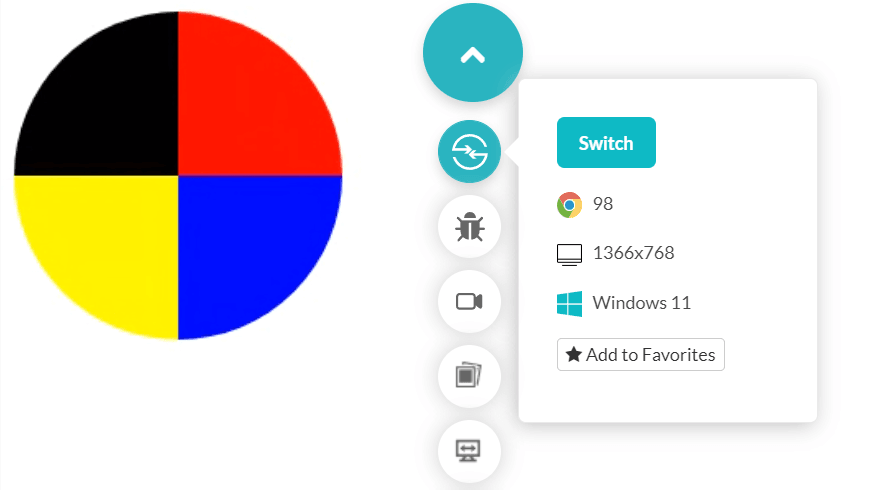
The following simple code divides a circle into four segments resembling a pie chart:
Output

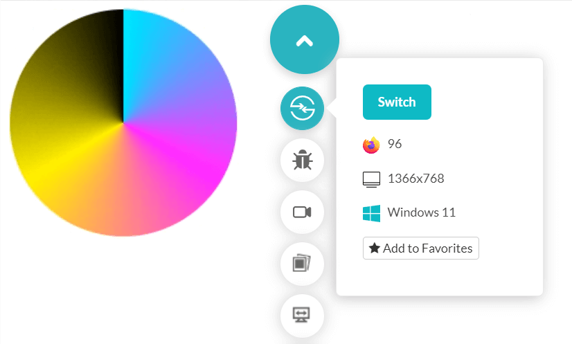
However, this is just a simple demonstration of conical gradients. They can also create a beautiful transition with just a single line of code as follows:
Output

The conical gradient in CSS rotates the color transitions from the circle’s center. Conical gradient color ends at the circle’s boundary rather than radiating from the center with different radii.
Pie charts are an excellent example of conical gradients.
The following simple code divides a circle into four segments resembling a pie chart:
Code:
<!DOCTYPE html>
<html lang="en" dir="ltr">
  <head>
    <meta charset="utf-8">
    <title>Conical Gradient</title>
  </head>
  <style>
  .conic-grad {
  background: conic-gradient(red 25%, blue 0 50%, yellow 0 75%, black 0);
  width: 200px;
 height: 200px;
 border-radius: 50%;
}
  </style>
  <body>

    <div class = "conic-grad"></div>
  </body>
</html>
Output

However, this is just a simple demonstration of conical gradients. They can also create a beautiful transition with just a single line of code as follows:
Code:
background: conic-gradient(cyan, magenta, yellow, black);Output

