As a beginner, one of your first concerns will be positioning your elements on the web page. Since most websites start by defining the width of elements in pixel numbers, it is often inevitable to begin placing these numbers in your code.
The above code creates a 100-pixel wide element with the applied background color on the web page.
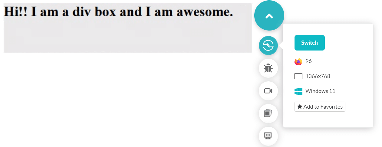
However, there is a flaw with this approach. This works well since you developed it as per your screen and tested it.
What if I now display the same web page on a mobile device?
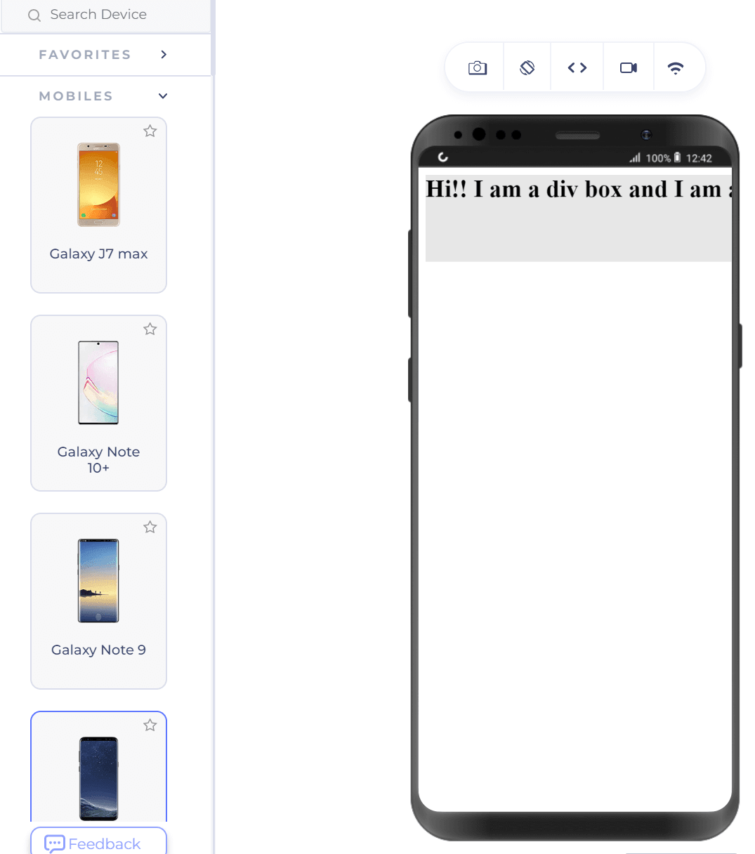
Our box did not render entirely on the mobile device as it did on the desktop where we tested it.
Also, when we render the web page on a tablet, such as the iPad Pro, as shown below, the div box is half the size of the screen.
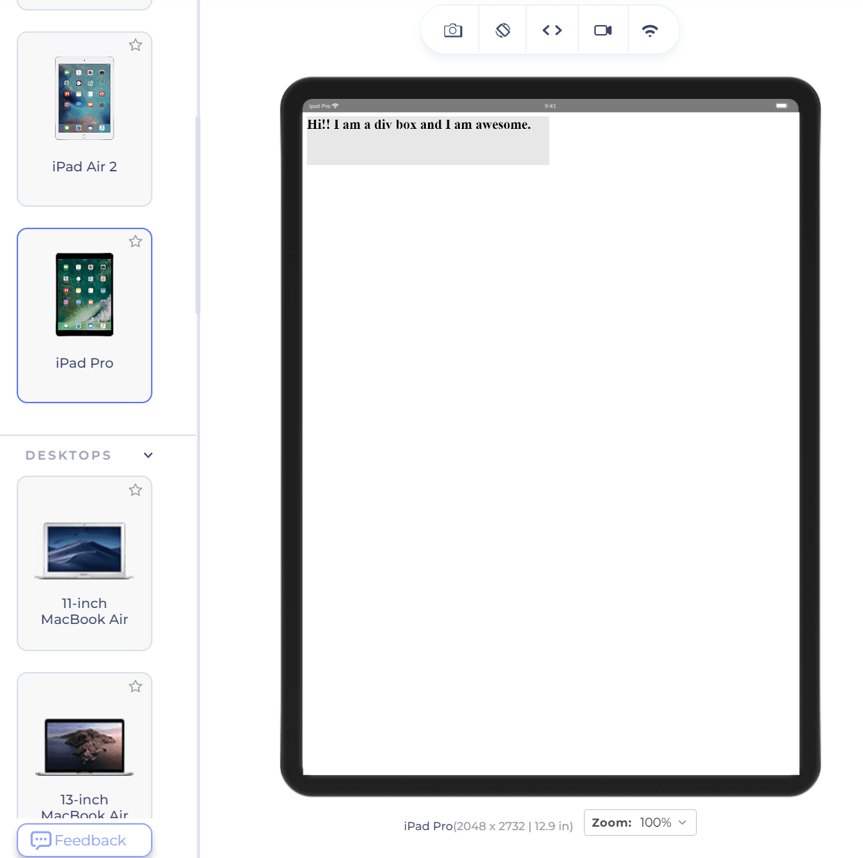
It would be less than ⅓ of the screen on a desktop (depending on the resolution). This problem is easy to identify as only one element is located here. However, developing a complete web page on your desktop and checking many elements will surprise you.
The CSS tricks to avoiding such surprises are using percentage values instead of absolute numbers. For the same code, let’s change the width from 500px to 30% as follows:
The desktop representation of the div remains the same. But notice how it changes on the same mobile device selected as shown above.
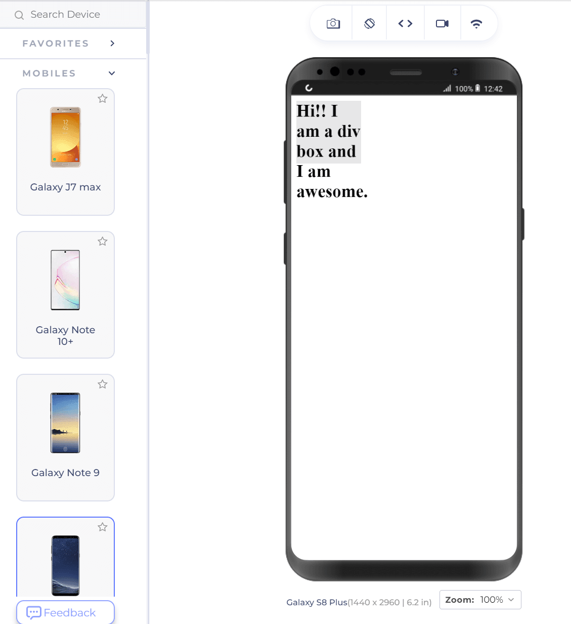
Except for the ugly part of text-overflow in the above screenshot, notice that the div box still covers 30% of the device width. This is extremely helpful in resolving browser compatibility issues and developing a consistent website.
Code:
<!DOCTYPE html>
<html lang="en" dir="ltr">
  <head>
    <meta charset="utf-8">
    <title>Absolute Numbers</title>
  </head>
  <style>
      div {
        background-color: #e7e7e7;
        width:500px;
        height: 100px;
        font-weight: bold;
        font-size: 28px;
      }
  </style>
  <body>
      <div> Hi!! I am a div box and I am awesome. </div>
  </body>
</html>
The above code creates a 100-pixel wide element with the applied background color on the web page.
However, there is a flaw with this approach. This works well since you developed it as per your screen and tested it.
What if I now display the same web page on a mobile device?
Our box did not render entirely on the mobile device as it did on the desktop where we tested it.
Also, when we render the web page on a tablet, such as the iPad Pro, as shown below, the div box is half the size of the screen.

It would be less than ⅓ of the screen on a desktop (depending on the resolution). This problem is easy to identify as only one element is located here. However, developing a complete web page on your desktop and checking many elements will surprise you.
The CSS tricks to avoiding such surprises are using percentage values instead of absolute numbers. For the same code, let’s change the width from 500px to 30% as follows:
Code:
width:30%;The desktop representation of the div remains the same. But notice how it changes on the same mobile device selected as shown above.

Except for the ugly part of text-overflow in the above screenshot, notice that the div box still covers 30% of the device width. This is extremely helpful in resolving browser compatibility issues and developing a consistent website.
