
Hello everyone,
I’m experiencing several issues with my website on mobile devices and would appreciate the community’s help in resolving them. Here are the problems I’m facing:
I’m using Bootstrap for the layout and carousel.
I’ve optimized images and minified CSS/JS files.
I appreciate any help or suggestions. Here are some screenshots to better illustrate the issues:
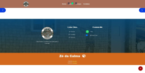
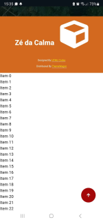
I’m experiencing several issues with my website on mobile devices and would appreciate the community’s help in resolving them. Here are the problems I’m facing:
- Website not opening on some mobile devices:
- On some devices, the website doesn’t load at all. On others, it loads but with layout issues.
- Carousel on the homepage not showing:
- On some devices, the carousel on the homepage doesn’t appear.
- Extra space after the footer/credits:
- There’s extra space after the footer on some pages. On others, items like “item 0”, “item 1”, etc., appear.
I’m using Bootstrap for the layout and carousel.
I’ve optimized images and minified CSS/JS files.
I appreciate any help or suggestions. Here are some screenshots to better illustrate the issues:

