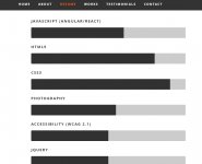
Hello I have created my portfolio, had a few questions.
www.haseebrahman.com
www.haseebrahman.com
- I wanted my headshot to be less narrow and a bit bigger
- In my "works" section I wanted the boxes to be a bit bigger and legible, and wanted to be able to add four more boxes underneath. Im not sure if the image on the home page is to smushed that's why it looks like that
- My contact us form isn't working, when users clicked submit, I wanted that information to be emailed.
- Is there any thoughts/ideas you guys have to improve my site


